Shopping for the perfect tile for your next home project? Whether you’re redoing a backsplash, renovating your bathroom or making a flooring upgrade, tile is a popular choice for many reasons. Matching up two or more different tiles is a great way to create a stylish design, but it can be a challenge to get right. Here’s a quick guide to playing tile matchmaker to make sure your tile project is a masterpiece.
Simple Matching
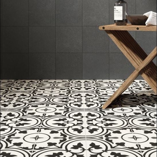
The simplest form of tile matching looks like this: find a tile you like and pair it with another tile that features the same color. So, a white tile with a charcoal gray pattern looks great against a solid charcoal tile. Other ways to match tile can be a bit more complex—let’s take a look.

Colorful Pairings
If you’d like to find the perfect match for a more colorful tile you’ve got your eye on (such as Gioia) consult the color wheel. Complementary colors—those directly opposite each other on the color wheel—can be blended for an effect that’s visually appealing and harmonious (not to mention bold). Using Gioia as an example, basic complementary color pairings include Azure and Papaya (blue and orange) or Lime and Rosso (green and red).
Colors that are analogous (next to each other on the color wheel) are also safe bets when it comes to playing tile matchmaker. For instance, a tile color scheme that incorporates a mix of blue, turquoise and green will have visual appeal.

Neutral on Neutral
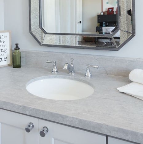
If your favorite tiles tend toward neutral colors, the only thing you need to keep in mind when pairing is color temperature. Generally speaking, warmer neutrals—those with yellow undertones like tan, cream and “greige” (warm gray)—can be mixed and matched with each other. Likewise, tones on the cooler side of the spectrum—those with blue undertones such as silver, slate and charcoal—should pair beautifully together.
This is not a hard-and-fast rule, but it can be a good place to start if you’re trying to find a gray tile that looks good with a tan one, for instance.
Monochrome
Monochrome may sound like a boring word, but it’s a timeless type of color pairing that can create a beautiful effect on your tile design. This involves using various shades of the same color. For example, if you’ve chosen a gray tile, you can safely pair it with other tiles that are either darker or lighter shades of gray, including black and white. Likewise, a patterned tile in navy blue and white will complement tiles in other cool blue shades, such as sky blue or slate.


